5 Practical Solutions to Make Responsive Data Tables
5 Practical Solutions to Make Responsive Data Tables
Mar 2024


As you may know, today’s design requires taking care of various types of screens and sizes so we designers have to make the results of our work as responsive as possible. That may cause some problems, especially when it comes to fitting a huge amount of data into narrow mobile phone interfaces.
The reason I decided to share the solutions with you is the fact the most common things I struggled with were data tables.
How to fit a wide data table on mobile screens without losing its purpose and readability?
I found 5 common solutions to handle data tables on wide screens such as smartphones or tablets in vertical mode. You can use it immediately in your daily work as a designer — let’s go!
Shorten
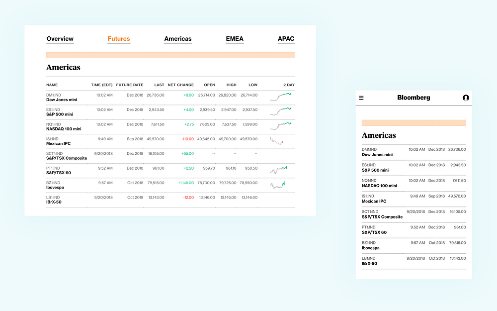
The most straightforward one, it’s just about cutting out unnecessary columns and keeping the table concise by leaving the crucial data only. The example below shows the Bloomberg website with only 4 of 9 columns on the mobile view.
Applicable
any kind of data
various types of content
Pros
easy to use
easy to develop
simplicity
Cons
limited space for data presentation
need to resign from part of the data
If you don’t want to drop any of your data, the other solutions may be a better fit for you.
Moveable
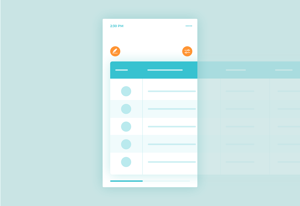
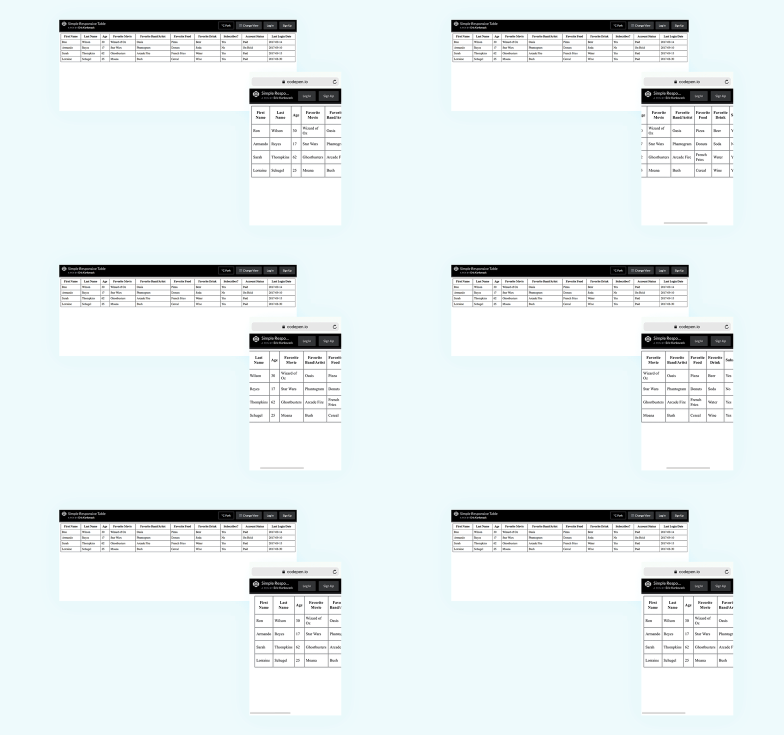
This solution is not quite responsive but easy to use and fast in development. It’s just about using swipe gestures to scroll through the whole table horizontally.
\
Applicable
for wide tables (3–8 columns)
for short tables (recommend to keep all height of the table above the fold)
Pros
easy to develop
easy to use
Cons
not for large amounts of content
the legend is not visible after scroll
Extras
focus mode to markup the whole row to make sure that we’re looking at the proper data while scrolling
filter columns — hide and show particular columns
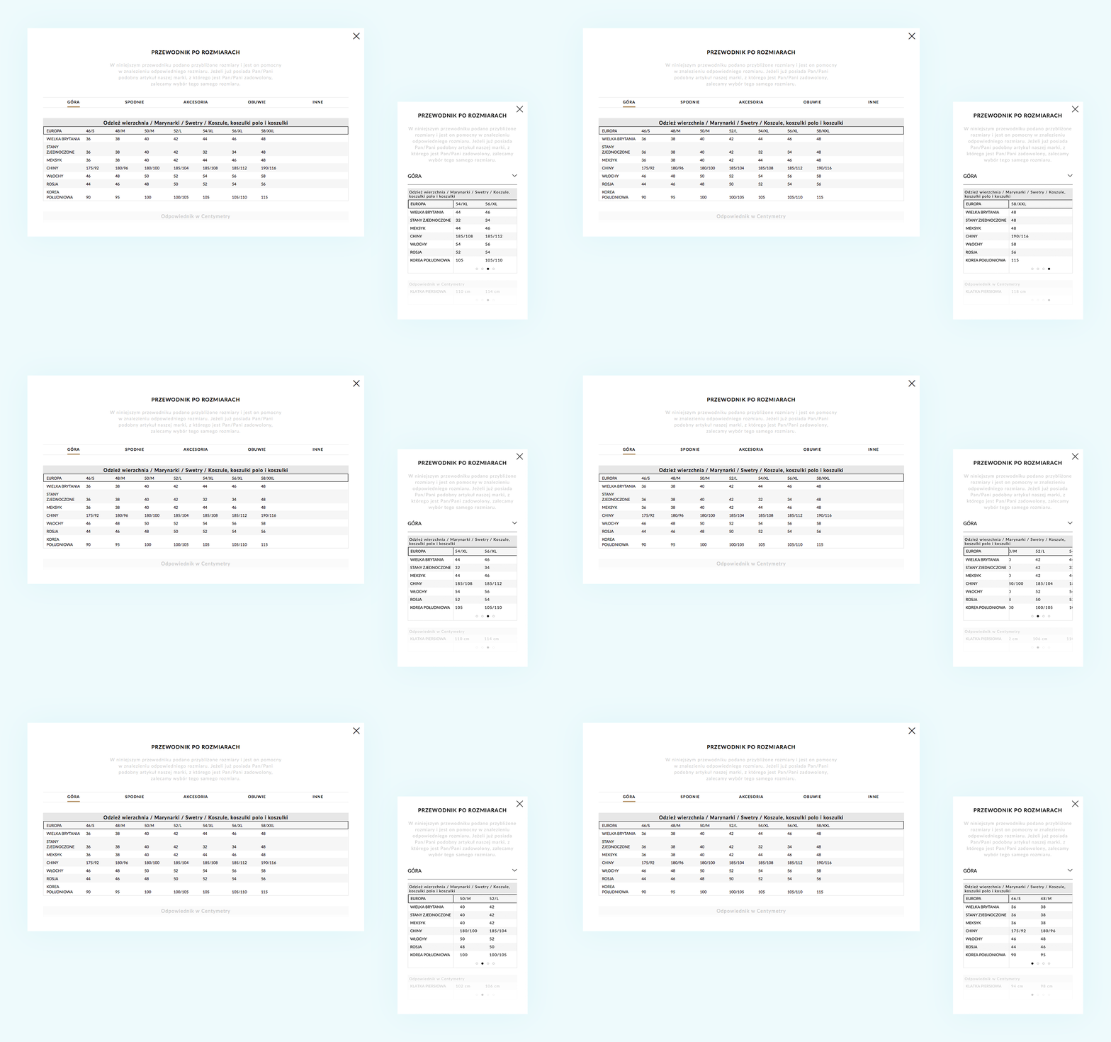
Collapsed
Applicable
for short columns
for short tables
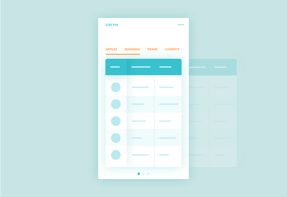
useful when swapping columns into rows
Pros
easy to use
the legend is visible all the time
Cons
for short data only
Extras
tabs representing columns can be used to navigate quickly
Transformed
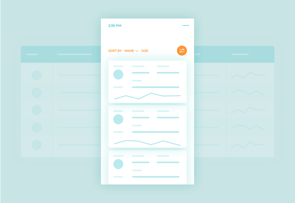
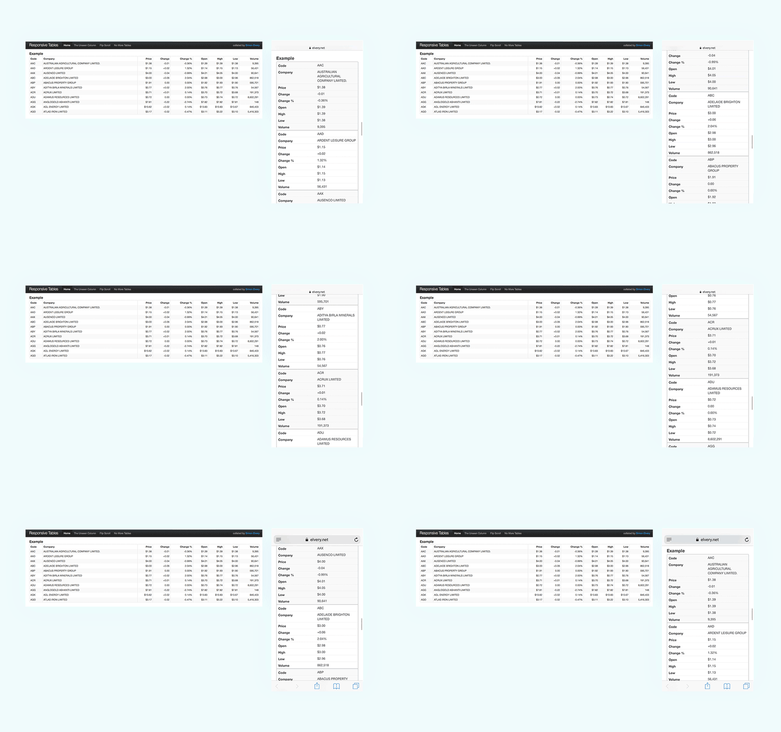
It’s a bulletproof solution for the toughest tasks. The main rule is a collapsing of the table rows into separate cards.
Applicable
a huge amount of data
various types of content
Pros
useful with a huge amount of data and its size
ability to collapse and hide some data
a versatile form of data presentation
Cons
repetitive column names
hard to compare particular data between rows
Extras
ability to filter and sort the content with ease
ability to divide the content into separate pages
Conclusion
Responsive data tables are paramount for improving user experience across devices. Prioritizing accessibility and usability fosters seamless interaction with data. Embracing these practical solutions enables businesses to adapt to evolving digital landscapes and engage their audience effectively.
As you may know, today’s design requires taking care of various types of screens and sizes so we designers have to make the results of our work as responsive as possible. That may cause some problems, especially when it comes to fitting a huge amount of data into narrow mobile phone interfaces.
The reason I decided to share the solutions with you is the fact the most common things I struggled with were data tables.
How to fit a wide data table on mobile screens without losing its purpose and readability?
I found 5 common solutions to handle data tables on wide screens such as smartphones or tablets in vertical mode. You can use it immediately in your daily work as a designer — let’s go!
Shorten
The most straightforward one, it’s just about cutting out unnecessary columns and keeping the table concise by leaving the crucial data only. The example below shows the Bloomberg website with only 4 of 9 columns on the mobile view.
Applicable
any kind of data
various types of content
Pros
easy to use
easy to develop
simplicity
Cons
limited space for data presentation
need to resign from part of the data
If you don’t want to drop any of your data, the other solutions may be a better fit for you.
Moveable
This solution is not quite responsive but easy to use and fast in development. It’s just about using swipe gestures to scroll through the whole table horizontally.
\
Applicable
for wide tables (3–8 columns)
for short tables (recommend to keep all height of the table above the fold)
Pros
easy to develop
easy to use
Cons
not for large amounts of content
the legend is not visible after scroll
Extras
focus mode to markup the whole row to make sure that we’re looking at the proper data while scrolling
filter columns — hide and show particular columns
Collapsed
Applicable
for short columns
for short tables
useful when swapping columns into rows
Pros
easy to use
the legend is visible all the time
Cons
for short data only
Extras
tabs representing columns can be used to navigate quickly
Transformed
It’s a bulletproof solution for the toughest tasks. The main rule is a collapsing of the table rows into separate cards.
Applicable
a huge amount of data
various types of content
Pros
useful with a huge amount of data and its size
ability to collapse and hide some data
a versatile form of data presentation
Cons
repetitive column names
hard to compare particular data between rows
Extras
ability to filter and sort the content with ease
ability to divide the content into separate pages
Conclusion
Responsive data tables are paramount for improving user experience across devices. Prioritizing accessibility and usability fosters seamless interaction with data. Embracing these practical solutions enables businesses to adapt to evolving digital landscapes and engage their audience effectively.
Related posts
Jul 2026
Mastering Frontend Development Code Quality in 2026
Frontend code quality isn't about perfectionism — it's about building software that other people (including future-you) can understand, trust, and extend without fear. In 2026, with AI copilots writing more of our boilerplate and teams shipping faster than ever, the human judgment behind clean, scalable code matters more, not less. Here's a concise playbook.


Jul 2026
Mastering Frontend Development Code Quality in 2026
Frontend code quality isn't about perfectionism — it's about building software that other people (including future-you) can understand, trust, and extend without fear. In 2026, with AI copilots writing more of our boilerplate and teams shipping faster than ever, the human judgment behind clean, scalable code matters more, not less. Here's a concise playbook.
Dec 2023
Optimising your design system with Figma’s variables
Over the past year, the idea of developing a new design system, particularly leveraging CSS custom properties for implementing light and dark modes, had been on my mind.

Dec 2023
Optimising your design system with Figma’s variables
Over the past year, the idea of developing a new design system, particularly leveraging CSS custom properties for implementing light and dark modes, had been on my mind.